Color isn’t just for crayons and rainbows; it’s the secret sauce that can make or break a design. When it comes to cohesive color use, it’s all about creating harmony that makes the eyes dance and the heart sing. Imagine walking into a room where every hue feels like it belongs—like a well-rehearsed choir serenading your senses. That’s the magic of cohesive color!
But let’s be real: picking colors can feel like a game of roulette. One wrong shade and your masterpiece could end up looking like a toddler’s finger painting. Fear not! With a few clever strategies and a sprinkle of creativity, anyone can master the art of color cohesion. Buckle up as we dive into the vibrant world of color combinations that not only look good but also tell a story worth sharing.
Table of Contents
ToggleUnderstanding Cohesive Color Use
Cohesive color use creates a unified and visually appealing atmosphere in design. Understanding its nuances plays a crucial role in achieving an aesthetically pleasing environment.
Definition of Cohesive Color Use
Cohesive color use refers to a deliberate selection of colors that complement and enhance each other. This approach ensures that color choices promote harmony rather than conflict. A color palette with defined relationships often leads to effective visual storytelling. Designers rely on theory, experience, and observational skills to create this cohesion. By evaluating color interactions, they achieve a balanced look.
Importance in Design
Importance of cohesive color use in design cannot be overstated. It establishes a sense of belonging and connection within a space. Cohesion influences mood, guiding emotional responses. Strategic color choices enhance brand identity, making it recognizable. Studies show that colors can affect perceptions; thus, mindful selection proves essential. Cohesive palettes engage audiences, driving deeper connections with content. They amplify intended messages, ensuring clarity and impact. Color cohesion ultimately elevates overall design effectiveness.
Principles of Cohesive Color Use
Cohesive color use involves understanding key concepts that guide effective color choices. Mastering these principles can significantly elevate design quality.
Color Theory Basics
Color theory forms the foundation of effective color usage. The color wheel illustrates relationships between colors, including primary, secondary, and tertiary shades. Understanding color harmony types—complementary, analogous, and triadic—provides insights into creating attractive palettes. Complementary colors, for instance, enhance each other when paired, while analogous colors create a sense of unity. Additionally, warm and cool colors generate distinct emotional responses, aiding in mood setting. Knowing how these concepts interact helps designers select colors that resonate well with viewers.
Harmonious Color Combinations
Harmonious color combinations create visually appealing designs. Selecting colors that work well together fosters a sense of balance and unity. Using 60-30-10 proportions can establish a dominant color while allowing for accents. For instance, employing a primary color for walls, a secondary for furniture, and an accent color for decor achieves a cohesive look. Designers often utilize tools like color palettes and generators to explore varying shades in real-time. Testing combinations through mock-ups or digital platforms ensures color choices align with intended emotions, enhancing overall aesthetics.
Techniques for Achieving Cohesive Color Use
Cohesive color use enhances visual appeal and emotional impact in design. Exploring various techniques can assist designers in creating harmonious environments.
Monochromatic Schemes
Monochromatic schemes involve using different shades and tints of a single color. Such an approach creates uniformity and simplicity, leading to a serene atmosphere. Designers can also experiment with varying tones to add depth and interest. Many brands utilize monochromatic palettes to convey a specific mood or identity. For example, a light blue shade can evoke calmness, while a deeper blue can project professionalism. Effective implementation of this scheme requires careful attention to contrast, ensuring elements remain distinguishable. Designers can achieve balance by integrating textures or patterns alongside solid colors, enriching the visual experience.
Analogous Color Schemes
Analogous color schemes consist of colors that are next to each other on the color wheel. This method promotes cohesion and fluidity, resulting in a balanced visual effect. Designers often select one dominant color while incorporating supporting tones to enhance harmony. An example includes using green, blue-green, and blue for a refreshing ambiance. Employing these combinations can evoke specific emotions and responses from viewers. Key to success in this scheme is maintaining a consistent theme, ensuring colors complement rather than clash. By utilizing analogous colors effectively, designers create inviting and unified spaces that resonate with audiences.
Examples of Cohesive Color Use in Various Fields
Cohesive color use manifests across many fields, creating inviting and engaging environments or visuals. Below are notable examples from interior and graphic design.
Interior Design
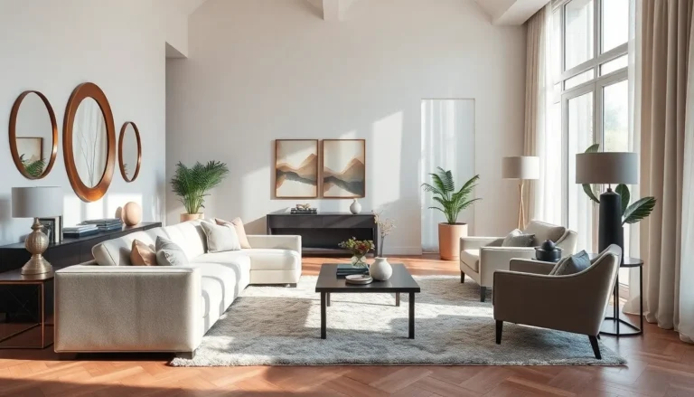
In interior design, color cohesion influences the overall ambiance of a space. Designers often utilize a monochromatic scheme, varying shades of a single color to foster tranquility and uniformity. A living room featuring various tints of blue can evoke calmness while ensuring visual consistency. Alternatively, an analogous color scheme may pair greens with yellows, creating a vibrant and inviting atmosphere. The use of strategic color accents like cushions or artwork can enhance the theme without overwhelming it. Cohesive color use in furniture, paint, and accessories contributes significantly to the emotional impact a space can exert on its inhabitants.
Graphic Design
Graphic design relies heavily on cohesive color combinations to convey messages effectively. Branding often employs a triadic color harmony, balancing three colors equidistant on the color wheel to create a lively yet balanced visual. For instance, a tech company’s logo might incorporate blue for trust, green for innovation, and orange for energy. This combination fosters a memorable identity. Designers utilize tools like Adobe Color to experiment with palettes before finalizing choices, ensuring emotional alignment and visual effectiveness. Consistency in color application across marketing materials fortifies brand recognition and creates a unified look that resonates with audiences.
Cohesive color use is a powerful tool in design that transcends mere aesthetics. It fosters connection and enhances emotional responses while ensuring that visual storytelling resonates with audiences. By mastering the principles of color harmony and employing strategic techniques, designers can create environments that are not only visually appealing but also meaningful.
The journey to achieving color cohesion may be challenging but with the right strategies and tools, anyone can cultivate a harmonious palette. As designers explore and experiment with color combinations, they’ll discover the profound impact cohesive color use has on overall design effectiveness and brand identity. Embracing this art form opens the door to endless creative possibilities.